«LESS IS MORE» ON A 34 SQUARE METER HOME AND HOW IT WAS DONE
«Less is more» on a 34 square meter home. How to do it?
To fit all the necessary for living into an apartment sized only 34 square meters calls for clever solutions. The Estonian architect Allan Pilter and his partner managed to complete the task magnificiently by using functionally every unit of their home. The interior design is by Allan himself.
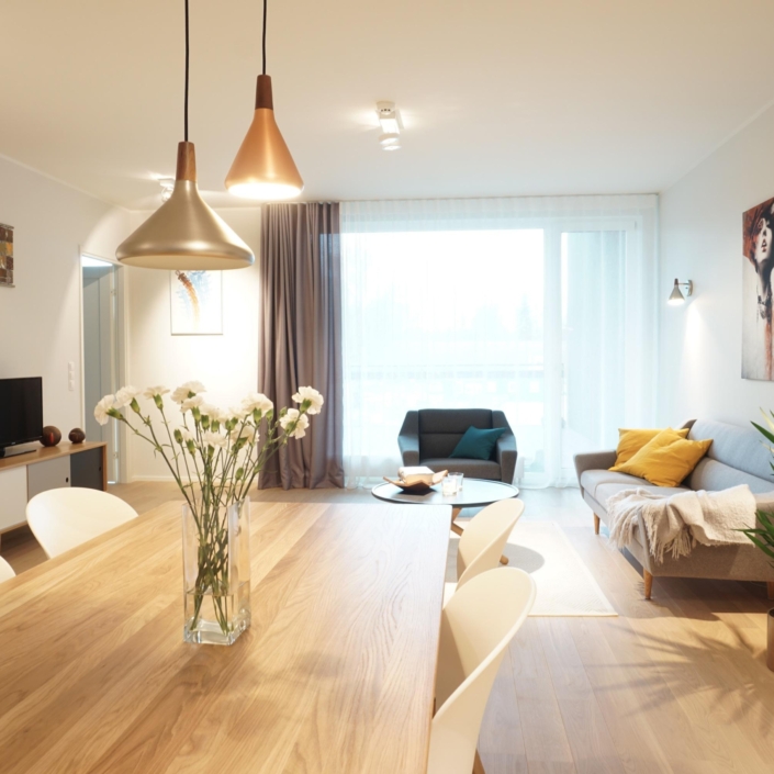
The algorithm consisted of self-designed built-in furniture, smart usage of available space, «less is more» mentality and some more hocus-pocus. The outcome is bright, minimal and above all very functional.
What is the essence of your home?
We set the mind to follow the «small living» principle when planning our home. It was like solving a problem in maths class with only one right answer. When all the functional details were thought through the interior design part came together as well, dictated by the peculiarities of the room. We always reminded ourselves to remember that less is more.
The apartment seems very spacious even though it’s size is only 34 square meters. Which clever solutions did you use to fit everything in the apartment?
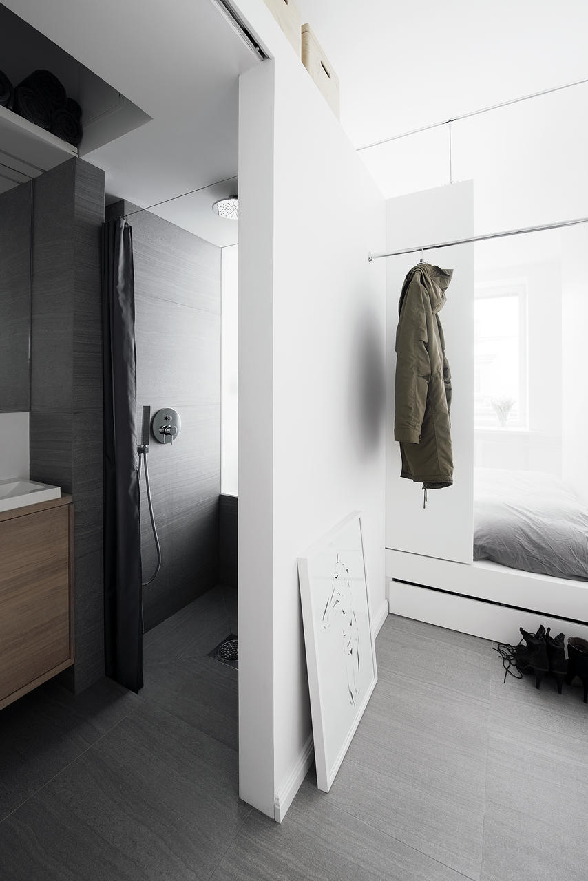
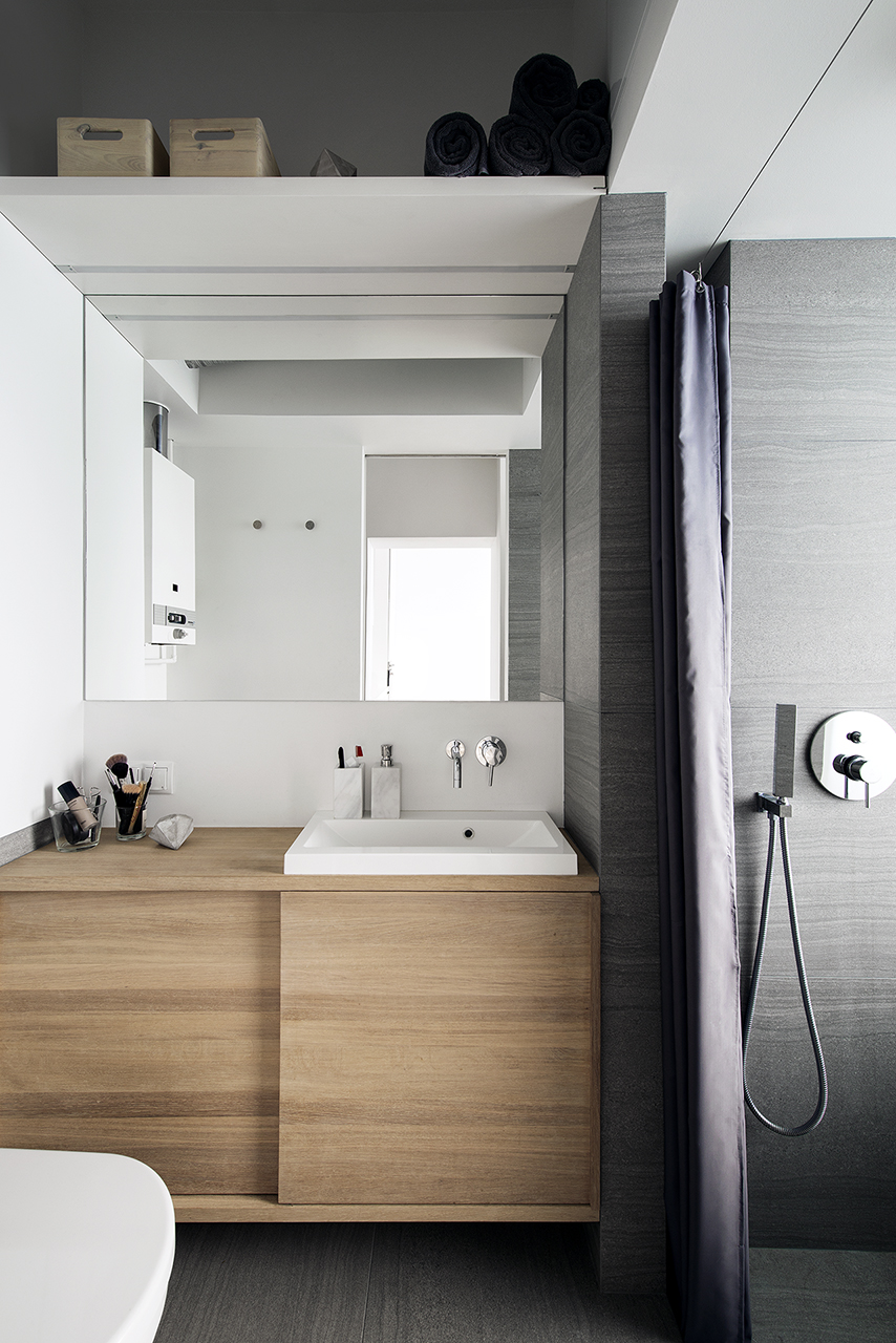
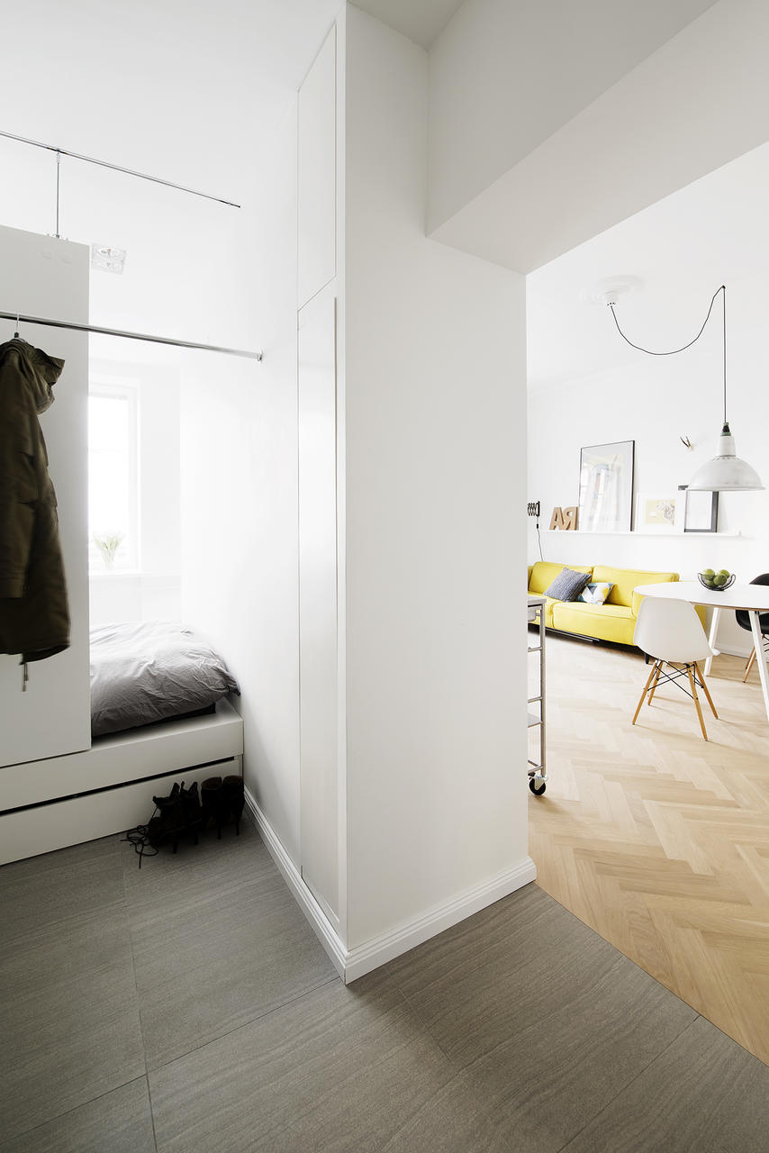
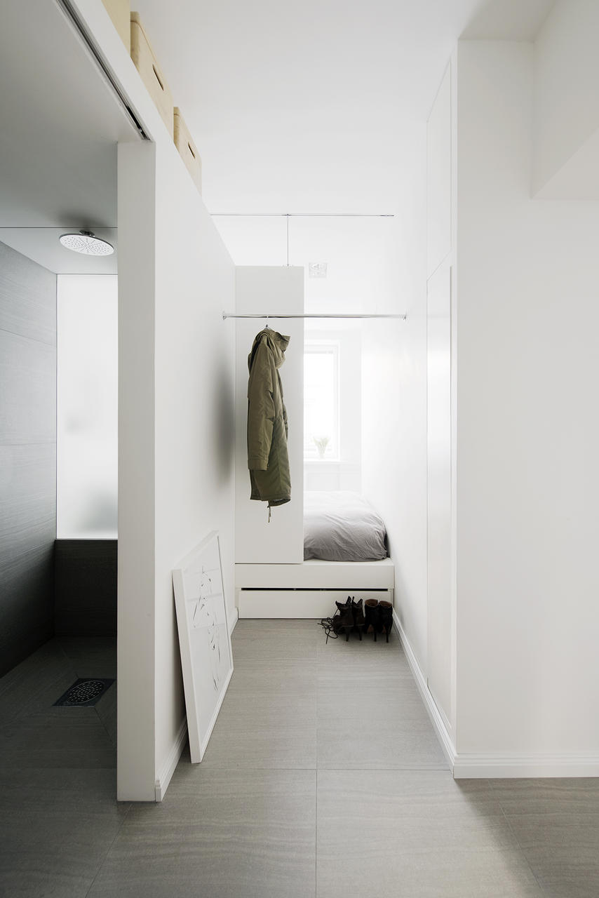
It doesn’t only seem, but it actually is spacious. The built-in furniture designed by ourselves allows to use effectively every gap and corner of the apartment and generally keep the appareance of the room clean and minimalistic. There are unusually many drawers under the inbuilt bed which are openable from both sides. Using the whole height of the room for wardrobe let us create two levels for hanging our clothes. The ceiling of the washroom is lowered to leave some extra box-room.
Planning a small home is revitalising yet disciplinary project, which eliminates many unnecessary things from your everyday living. Sometimes we have to even prove our friends that we actually do have the vacuum cleaner, ironing board and dusting brush in our home, because these things are usually hidden in the closets.
Which illusional hocus-pocus did you use to make the room seem more spacious than it its?
The apartment used to have two closed rooms: living room and kitchen. The new studio-like plan with open kitchen and bedroom exposes as many view fields as possible and enables the natural light to enter even the darkest corners of our home. The wall of washroom is made of opaline to let the daylight in. To still keep some privacy in the bedroom and toilet we have sliding doors, which when opened or closed blend in well and stay unnoticed.

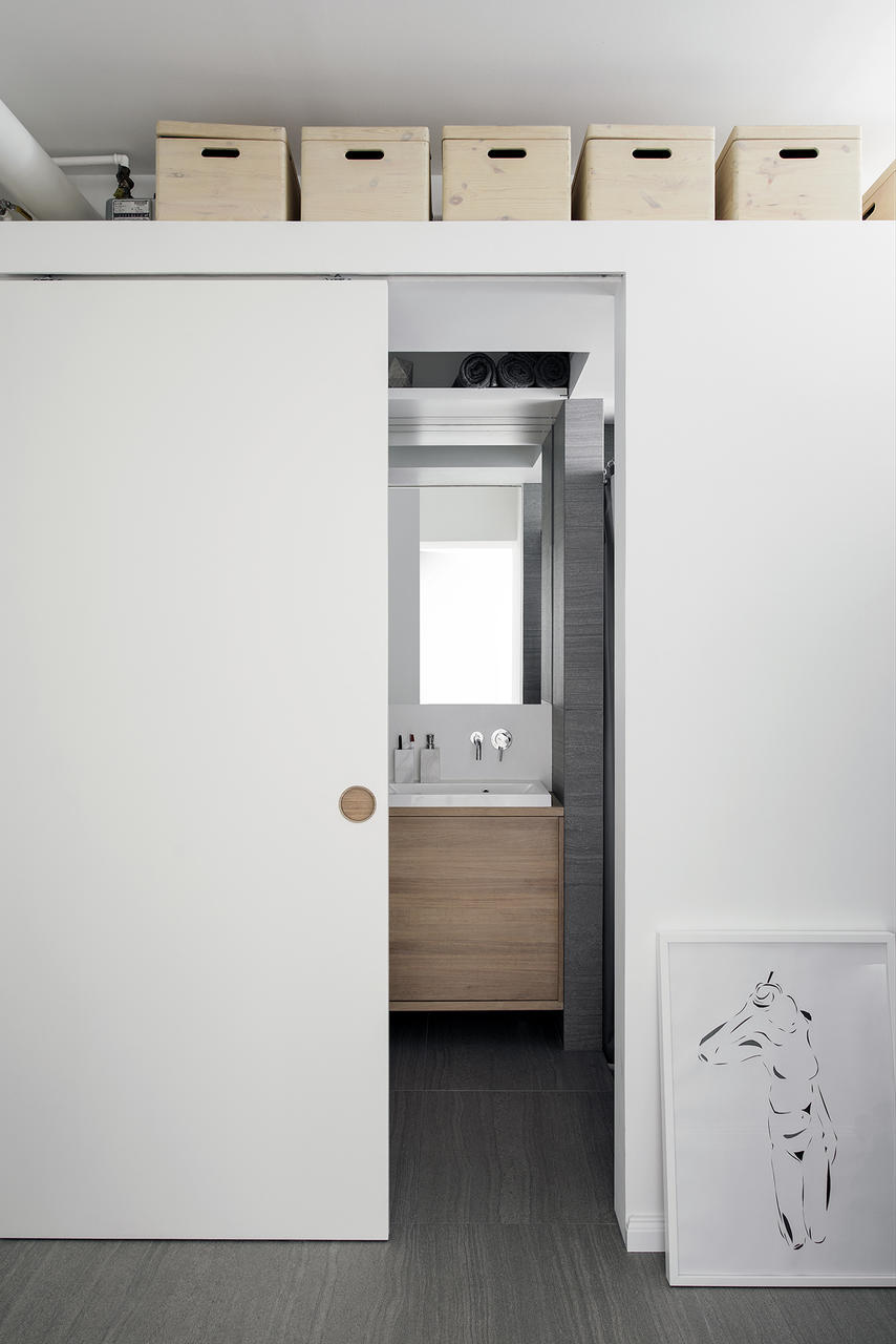
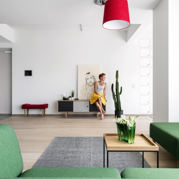
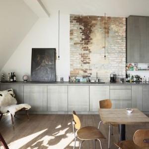
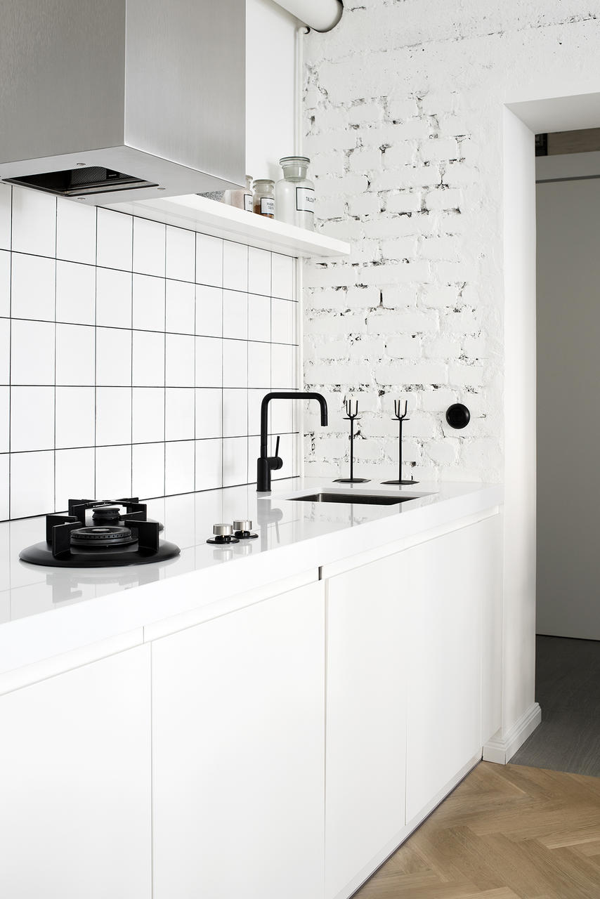
To visually extend the dimensions of the room even more, the decision of painting all the surfaces and inbuilt furniture white was made. Beside colors the textures also have immense role to play in tiny rooms. The contrasts of different textures illusionary make the room seem wider, like the livingroom brick wall and the smooth surfaces of the cabinets in the kitchen. The white background brings alive the interior details and open furniture.
The size of a room is defined by human dimesional aspect. Without furniture a place always seems smaller than when furnished, the overly piled up interior also appears tinier. That is why it is extremely important to find the proportionally correct objects for the room.

Where is the furniture and home decoration from?
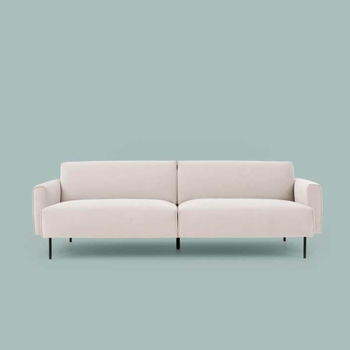
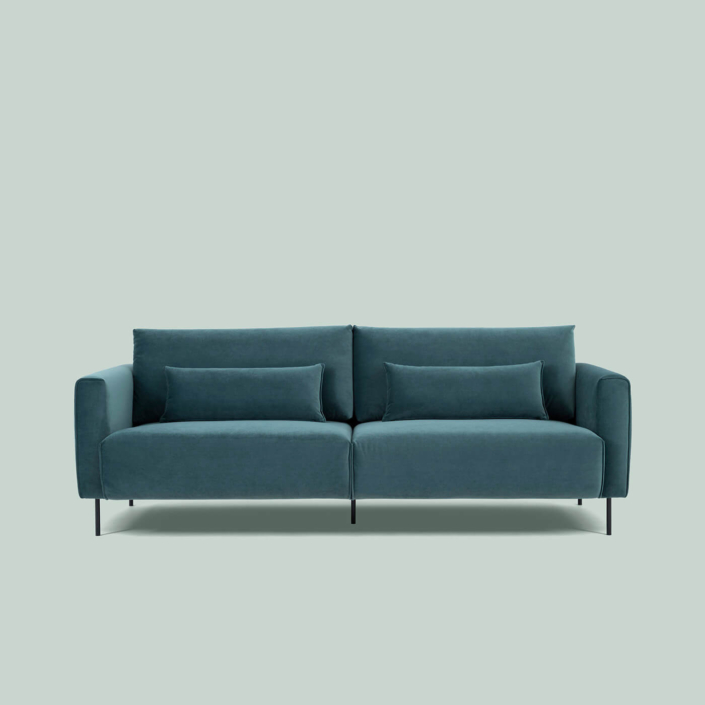
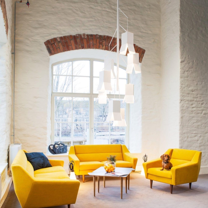
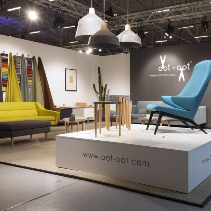
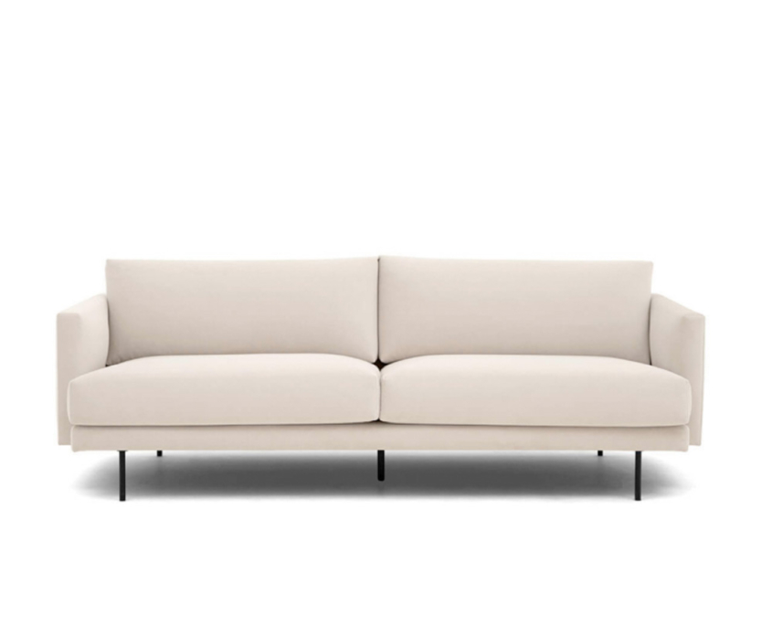
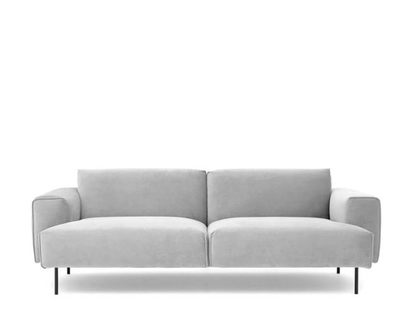
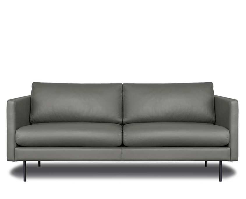
All the built-in furniture is designed and made by me. The kitchen is from Arens and was also worked out until every detail was in order. The sofa, dining table and some other home accessories are from BoConcept, dining chairs are combination of the Eames’s classics from Vitra and some vintage finds from Kaevuri Salong, living room luminaire is vintage from Oot-Oot Studio and the wall lamp is from the garage-workroom of my partner’s grandfather.
The art, book layouts and prints, in the bedroom and living room are from my artist grandfather’s collection. The piano chair, which was saved from an old submarine factory, belongs to the hallway, but every once in a while it ends up playing the role of a coffee table.

You are an architect who is also into interior design. How does this project show the esthetics of you as a designer and architect?
I believe in lifelong progress when talking about design esthetics. Within 15 years of working as an architect my signature style is still developing. The creativity and currentness in architecture and design changes all the time.
The essential value in my projects is functionality. The character of a certain space can be created only when adapting the room to it’s purpose. Everything else is dictated by the characteristics of the room. This home is a good example of how detailed and thought out projects I like to do.
Another important criteria in my design esthetics is simplicity. Even when the task is extremely complicated, the result – the final idea has to be clear, perspicuous and bring out the best qualities of the room. The unconventional and small spaces are the most challenging yet enjoyable things to work with.

What interesting are you working on right now?
Currently I am working on an major office project, some interior design projects and finalizing the Niine 7 apartment building project with Kaur Talpsepp.
Allan Pilter is an Estonian arhitect and co-founder of the company Kauss Architects. He graduated the Tallinn University of Applied Sciences Faculty of Architecture and has been working as an architect since 2002. His deeper interest in interior design started growing during last few years. In spare time he is either composing sounds (deserts, brief.pastiche), playing tennis, ping pong or discgolf.
Photos: Terje Ugandi
✄
Click here for Kauss Architects’s other projects.


